They don’t need Chris Hemsworth to return. Scrap the George Kirk
storyline, give Pine more money, and do a decent Mirror Universe movie,
and I guarantee there’ll be praise from Trek fans and
audiences, but don’t act like Pine isn’t key to the franchise’s current
success. It’s never wise to bet against Jim Kirk.
producer Adi Shankar said: “Losing Pine and Kirk is not a big deal and kind of cool.“
The Millennium Falcon: Battered, outdated, patched-up, seventh-hand piece of junk used by a small-time criminal.
The Enterprise: State of the art government funded and developed scientific research vessel designed to carry a large crew of elite scientists and diplomats on incredibly sensitive and important missions.
The Millennium Falcon: Never fails, reliable, decades after it’s been theoretically rendered obsolete it still works better than modern ships, can be easily maintained and repaired by two guys of questionable competence.
The Enterprise: Some catastrophic failure happens in every episode. An alien sneezes and the warp core almost melts down and kills everyone. The entertainment system can kill you. Oh shit the transporters are jammed again.
the color scheme is pitiful and the collars on the uniform shirts make me uncomfortable but they look so soft n cozy that i just can’t resist. comfort – 1, aesthetic – 0. 5/10.
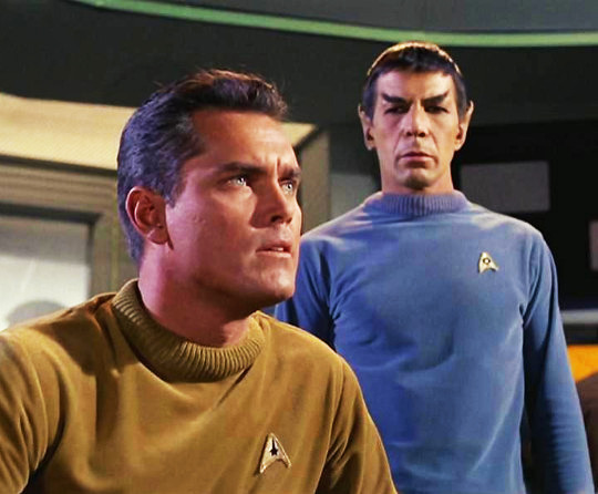
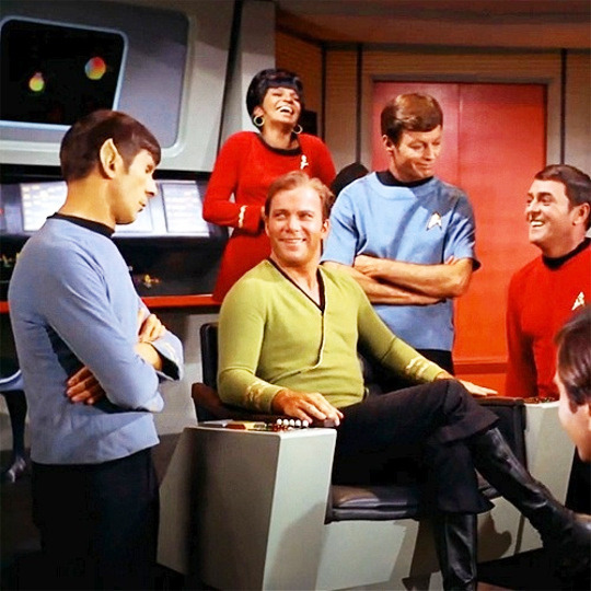
tos
now THAT’S more like it! the eye-watering primary colors that clash horribly with the set??? the enormous glittery division badges sewn on the breast??? the fantastically impractical high-heeled boots??? absolutely fucking superb. also tos had the fatshirt and you can’t top that 10/10.
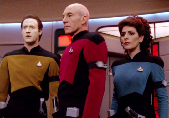
tng
they kept the black/primary color block contrast and the black paneling has a flattering effect on bodies of all shapes and sizes, which is a plus. someone clearly put time and effort into designing these. the v-neck collar is unfortunate though. 8/10.
ds9
not even its place in my heart as my favorite star trek can save these horrifying crimes against fashion and humanity. the gray fabric paneling on the jackets clashes hideously with the black. the turtleneck undershirts are cute but they’re mostly obscured by the aforementioned monstrosity. the original designs were better, which makes this whole thing doubly depressing, but still. what the fuck is that little slit down the front??? it doesn’t even button up. the station has a resident tailor so there’s really no excuse 0/10.
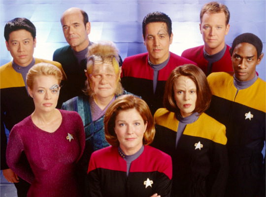
voy
these are the same as the original ds9 uniforms; the only major difference between them and the gray flannel failures is that they reversed the color scheme, which makes them marginally less painful to look at. for that my eyes are grateful, but the lack of originality is disappointing. 3/10.
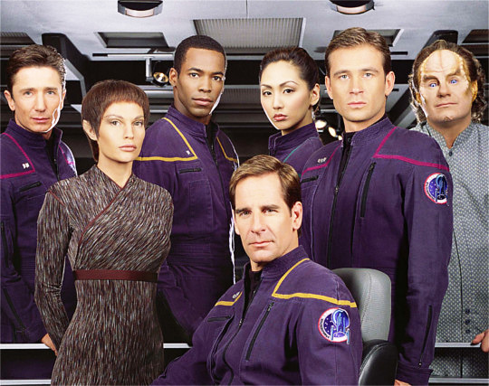
ent
what the fuck. these are just boiler suits with the starfleet insignia sewn on. what the actual fuck. we deserve better than this. -20/10.
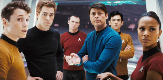
aos
an update on the tos uniforms that really wasn’t necessary. something about this version just doesn’t feel right. the sweaters are a little too much like sports shirts to be a solid look. and don’t even get me started on the lack of rank insignias on the women’s dress uniforms. that saying about how sequels are never as good as the original definitely applies in this case. 2/10.
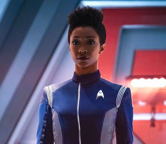
discovery
finally some good fucking food. the color scheme reminds me of the ent uniforms but the metallic paneling and fitted jackets saves the look. a moment of silence for the ent uniforms’ wasted potential. 6/10.
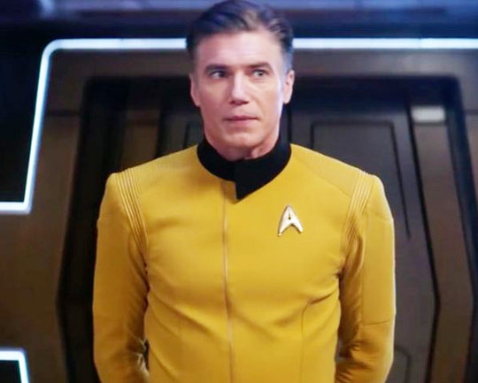
pike’s #look in the discovery season 2 trailer
the TOS sweaters are BACK, and this time they’re fitted, babey! it’s ugly!!! it’s impractical!!! it’s tacky!!! and i love it 100/10.
The best part of Amok Time is that it provides canonical proof that Leonard McCoy is ready and equipped to potentially fake his own death at any moment